Your B2B website is finally up and running and it's looking badass. Seriously. But shit just got real. You're getting visitors to your site, even inquiries about your product or service, but hardly any conversions. Now what? Is there a way to get those website conversion rates rolling in faster than you can say landing page? Hell yes.
Read on to find out the best practices for CTAs.
WHAT ARE CTAS?
So, what is a CTA, anyway? Some of you may be quite familiar with the term, but many of you may not be. So here goes the simplest definition you'll find on the internet: A CTA pretty much tells a visitor to take an action on your website. That's it.
MAKING IT RAIN CONVERSIONS
It doesn't take a rocket scientist to see that B2B buying behavior is changing, and fast. Due to the growth of e-commerce businesses, the advancement of mobile technology, and a shift in demographics, B2B providers are marketing to a different audience than they have in the past. This target audience is younger and more tech-savvy. But at the same time, some younger decision-makers must get the ultimate sign off from senior managers before making a purchase. This means that CTAs must be optimized for an audience that values timely information and nearly immediate results in this digital age.
So what does it take to get website visitors to make a purchase or sign up for a demo? A compelling, irresistible offer. Below are other factors that will affect the attractiveness of your offer and increase conversions.
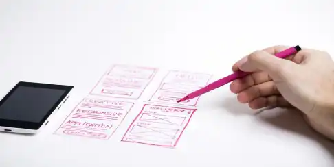
PLACEMENT
Let's face it. With online B2B buyers or any consumer for that matter, you only have a few seconds to grab and hold your visitors' attention. This means they want damn near immediate results and information to stare them right in the face. So your CTA should be in an optimal location, it should attention-grabbing, users shouldn't have to do a ton of searching to find it, and it should be immediately visible when they land on a page.
You can have the most awesome offer on the web, but if no one is able to find it on your page, then it's pretty much useless.
COPY
One of the best practices for CTAs includes writing meaningful copy with as little words as possible. Use words to provide value and relevance.
Take this B2B brand for example. The company's website acts as a portal through which businesses can find offices for rent. Potential customers can browse through thousands of offices featured on the website. A prospect has to click the main call-to-action to get more information about the lease on a particular office. This info would be sent via email.
The original CTA read "Order Information". They changed it to "Get Information" and saw a 38.26% increase in conversions. But how did changing one word make such a huge difference? The word "order" indicates something you have to do. "Get" shows that you're going to receive something without needing to perform an action to get it. That being said, words have power.
Speaking of power, you can use power words to add an extra incentive to push the user to take action. For example, let's say you're selling some kickass software that helps marketers automate certain tasks. Instead of saying "Download Software Today", offer a "Free 30-Day Trial" to incentivize your visitors and create a more compelling offer.
Here's an example of a B2B company that was really smart about playing with words. Friendbuy helps marketers drive referrals and get more customers using widgets on their websites. The company uses a real-time product demo as a selling point, which is what they included in their CTA. Their original CTA read, "Wanna see it? Share Friendbuy with friends!" They tested two new CTA buttons: "Test it out" and "See demo". The second variation, which was the "see demo" button increased the click-through rate over the original call to action by 211%. The demo CTR increased from 1.44% all the way up to 4.49%.
DESIGN
Design includes color, font, and structural elements that boost the aesthetic appeal of a page and promote easier navigation. Adding something as simple as an arrow to a CTA button or changing the button color can make all the difference. An example? A marketing company by the name of Monetate, which aims to help retailers increase their revenue, tested orange and blue CTA buttons for a product page. Big orange buttons have been proven to significantly increase conversions. But in the case of Monetate, when tested against the blue button, orange didn't come out on top. In fact, the blue button was 9% more effective in increasing conversions than the orange version.
BEST PRACTICES FOR CTAs AND USER EXPERIENCE IN 2019
When it comes to getting those clicks, your website must offer a seamless user experience for your visitors. If not, they'll click out and move on to the next business. You've probably heard that you should optimize your B2B website for mobile more times than you can count on your fingers (and toes). But there's so much more to creating the best user experience to your visitors than just mobile optimization. Below are some other tips for increasing your B2B lead generation and creating a great user experience, especially for small business websites.
MAKE YOUR CTA CLEAR AND EASY TO FOLLOW
You can't guide users to take an action if they don't know what they should be doing. "Click Here" is a simple CTA, but do users know what they're getting into when they "click here"? Nope.
Write clear copy that leads the way and helps potential customers understand exactly what they're about to experience once they click. Software company 37Signals understood this concept pretty well. Their original CTA was "Sign-up for a Free Trial". Their new CTA - "See Plans and Pricing" - increased sign-ups on the website by 200%.
CONSIDER BUTTON LOCATION AND DESIGN CAREFULLY
Making sure you have the optimal location and design for your CTA button is crucial to getting conversions. Take a page out of FreshBook's - a software company that helps accountants track time and income - they use bold colors to add interest and grab attention. They also do a great job of placing their CTA front-and-center for all to see.
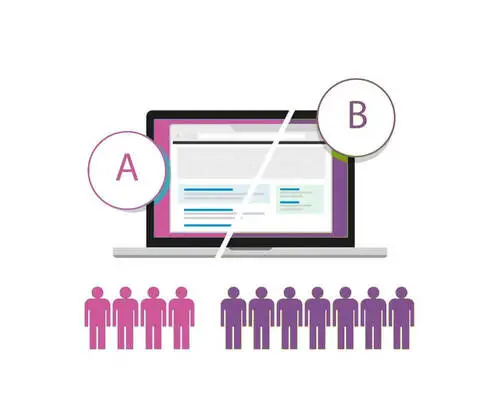
TEST, TEST, TEST
We won't go too far in depth about A/B testing, as we previously did a blog on that here. But just know that regularly doing tests on changes you've made to your CTA can help you see what works and what doesn't.
Hopefully, you can leave this blog with some fresh knowledge about increasing conversions for your B2B brand. But maybe it's still not working for you and you need some extra help. At MarComm, we're here to do just that.