

A fundamental part of your sales cycle is experimentation. What kinds of language, deals, and pricing helps you convert more clients and create more revenue?
If you're like most businesses, trying to find the answer to that is a constant uphill battle. Only around 22% of companies are happy with their conversion rates. And we'd be willing to bet that even the most satisfied business would jump at the opportunity to increase their conversions.
But, finding ways to increase the number of people jumping into your sales funnel isn't easy. How do you even start? After all, the majority of your conversions probably come through your website. How do you know what to change on your website to pull more users in? And how do you know that those changes will work?
This is where A/B testing comes in. This scientific method of discovering actionable changes that produce tangible results can single-handedly redefine your sales funnel.
So, what is A/B testing, and how does it work?
What is A/B Testing?
In short, A/B testing is taking two or more webpages and comparing them to see which performs better. To do this, you set up two (or more) pages to be randomly displayed to users. Then, you see which one has better conversions (or whatever your goal is) and keep the winner.
Here's a quick and simple A/B test example.
Let's say you have a landing page with a green CTA button. But, you just read that HubSpot claims to capture 21% more leads with a red CTA button. Uh oh! Now what?
With A/B testing, you would create a landing page with a red CTA and show it to half of your customers (at random). And, you would show the other half your original green CTA. So, half of your audience gets a green button; the other half gets a red one. Then, you see which one scores more conversions.
That's it! It's that simple. Of course, it can get way more complicated than that. But, we'll cover that in a second.
Here's the great thing — you can take that winner and run another A/B test with new webpages to continually improve your website. But, let's cut the bullshit here. A/B testing isn't a magical wand that grants you conversions. It's just a comparative tool that helps you improve upon an existing page. You still need to have a forward-thinking marketing strategy.
How to Run an A/B Test
Let's talk about how to actually run an A/B test. Here are the 7 steps you need.
- Pick something to test: Don't worry. We'll cover some great examples below of web elements that you can test.
- Think about your goals: For most of you, conversions will be at the forefront of your mind. But, you can A/B test just about any KPI. Want to see if a change in font keeps people on your blog posts longer? You can do that!
- Create your treatment: Each A/B test will have a control and a treatment. The control is your existing structure. The treatment is that new thing you want to test. So, if you have a big blue CTA button and you're interested in seeing if changing it to red will impact conversions, the blue CTA is your control, and the red CTA is your treatment. You can have more than one treatment.
- Test it: Now that you have your control and treatment, you can start testing them. There is software that will help you run these tests. But, we recommend partnering with your agency — who should already have the tech stack to facilitate an accurate A/B test.
- Wait: How long should you wait? You should test until you find something. Once you find significance, you're done. Most of the time, an A/B test lasts a few weeks. But, sometimes it lasts a few days. It depends on the test itself. A good rule of thumb is to wait AT LEAST seven days.
- Discover: This is where you start to dig through the data and draw significance out of the results.
- Repeat: Did that red CTA perform better? Great! But, what would happen if that CTA was green?
What Parts of Your Website Should You A/B Test?
You can A/B test literally anything on your website. Here are a few buckets where A/B testing can really help you out.
- CTAs (e.g., color, position, typography, size, etc.)
- Pricing (e.g., free trials, plans, etc.)
- Copy (e.g., blog post length, website content, eBooks, etc.)
- UX (e.g., image placement, nav menu, contact forms, etc.)
- Checkout process (e.g., shopping cart, length to checkout, payment gateways, etc.)
- Design (e.g., front page images, template colors, arrangement, etc.)
Yes. That's still a ton of area to cover. But, that list is in order of importance. You may not be able to get all the way to changing template colors. That's fine. But, you NEED to be A/B testing your CTAs, pricing, copy, and UX. Those are absolutely essential.
4 Killer A/B Testing Strategies
Let's go over some strategies of testing the first four critical buckets.
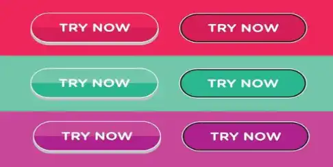
1. A/B Testing CTAs
There are about 3 and a half billion ways to test your CTAs. Here are a few of the most actionable ones.
Color
The color of your CTAs makes a massive difference in your conversions. And, color psychology is an emerging science so there's plenty of room to experiment.
But, there isn't a clear-cut way that colors impact conversions. You'll have to A/B test it.
Don't believe us?
Check this out.
HubSpot changed their CTA color to red, which boosted conversions by 21%. Seems simple, right? Well, Unbounce claims that orange CTAs convert higher than red-and-green CTAs. But, a Monetate study showed that blue CTAs converted higher than red CTAs. Wait! We aren't done. A VWO study claimed that red CTAs performed higher than other CTA buttons for them.
What did we learn from all of these studies? That changing your CTA's color can definitely impact conversion rates. What didn't we learn? What the best color is! You have to test that one out for yourself. It's going to have a lot to do with your contrast, landing page, and about a million other factors.
Videos
Should you add videos to your CTA? Great question! The answer is a resounding YES. QuickSprout made users watch a video before showing them a CTA and increased conversions by 144% . And, KissMetric says that CTAs with videos get 380% more clicks.
We haven't seen a single study showing that videos on CTAs don't work. But, knowing that videos work and knowing WHICH videos work are two different things.
This is where A/B testing comes in. Should you use an explainer video? Maybe. How about a demo video? Could work! You won't know until you try.
Buttons
This is another simple CTA change that can redefine your business. Have you ever thought about your actual CTA buttons? Fab changed their shopping cart button from an icon to text and it increased sales by over 49% . That's not all. Consolidated Label added a big green CTA button to their copy instead of simple text and boosted conversions by 62% .
Wait! Those are two different tests that produced contradictory results, right? Yes, yes they are. A/B testing is about figuring out what works best for YOU — not following someone else's strategy.
.jpg)
2. A/B Testing Pricing
We're stepping into dangerous territory when it comes to A/B testing pricing. Yes. You can give two sets of customers completely different pricing models on your product/services. But, should you? No! That's a disaster waiting to happen. When customer A figures out that customer B paid less than them, they're probably going to get a little pissed.
So, what do you do?
How do you figure out if there is a better pricing model for your products/services that grants you better ROI?
You test against features!
You can offer two different customers completely different price points IF you are also offering them completely different features. Klipfolio used A/B testing on features to design their entire pricing model. And it worked!
You have to be super careful with this. You need a decent sample size, and you need to be forward with customers if they ask you why their friend received a different offer.
But, the value in A/B testing pricing structures doesn't end here.
What about deals?
EA A/B tested a discount on Sim City 4. This one is interesting. On test A, they gave anyone who pre-ordered Sim City 4 a $20 discount on ANY other game. On test B, they didn't. So, if group A ordered Sim City 4, they got a $20 discount. Group B got nada.
Obviously, group A performed better, right? Nope! 40% more people pre-ordered the game when they were presented with option B (the one with no incentive!) Yeah. Sometimes things aren't always as simple as they seem. We could play the guessing game as to why this is. Maybe customers thought that the discount meant the game was going to be worse. After all, why offer a discount on a AAA title? Or, maybe people just weren't interested in getting a bonus discount. Either way, A/B testing can help prove your hypothesis wrong. Even when you're pretty sure it's spot on.
3. A/B Testing Copywriting
This is another area where you can get hyper-granular. Since 70% of your users would rather learn about your company through your website content itself instead of ads — your copy makes a big impression. Let's go over a few of the things you can test as far as copy is concerned.
- Font size: It may sound silly, but the size of your font has an impact on your readers. WhoAcceptsAmex increased conversions by 32% just by bumping up the size of their font.
- Word choice: Should you say "Buy Now" or "Shop Now"? If you're Black and Decker, Buy Now increases your conversions by 17% . Should you say "Contact Us" or "Request a Quote"? If you're Iron Mountain, Request a Quote boosts conversion rates by 140% . Small changes can have a considerable impact.
- Font type: No joking. Your font choice also influences customers purchasing behavior. Michael Martin ran a study that showed that the top websites use Sans font. The rationale was that Sans is more natural to browse and read. But, your font will depend on your website and your brand. Test a few out and see what happens.
There are thousands of ways to test copywriting. You could see if a laid back tone leads to more time spent on-page. Or, you could change the font color or link color up to see if it increases engagement KPIs. The potential here is unlimited.
4. A/B Testing the User Experience
We all know that user experience is important. We could throw a bunch of statistics at you ( 60% of your users will completely stop engaging if they can't easily browse your site by-the-way) but we won't. You know UX is critical. We know it.
But, did you know that simple changes can significantly grow your revenue?
Arenaturist boosted conversions by 52% by changing their nav menu from horizontal to vertical. That's 50% more web conversions from a simple nav bar change. Changing your wireframes (the layout of your site) can increase conversion rates by over 340% ! And, adding a "hottest sales" tab can increase eCommerce conversions by over 40% .
What can you do with your UX?
Final Thoughts
If there's one thing you take away from this post it should be this — you won't know until you try. There is no "perfect" answer to what website elements will work best for you. You have to A/B test to figure it out. Sure, red CTAs worked for HubSpot. That doesn't mean that they'll work for your unique brand.
A/B testing is all about finding out exactly what works for you and constantly improving upon your existing sales ecosystem.
Does all of this sound like a pain in the ass? We get it! Don't worry. We've got your back. Are you looking for an agency that knows the ins-and-outs of A/B testing? Contact us . Let's boost those conversion rates together!
Recent Posts
Best Practices for CTA's That Will Give You a Killer B2B Brand
Your B2B website is finally up and running and it's looking badass. Seriously....
What Makes a Good Landing Page in 2019?
Your product landing page is like a late-night TV infomercial. It features all...

The Elements of a Kick Ass Website Design That Converts
Think of your website as a storefront: the facade that every person who walks...
