Nothing lasts forever. It sounds cliche, but the saying rings true for many brands across the world. Maybe even yours. The truth is, consumers get bored. Attitudes and tastes evolve over time. Competitors make big changes that force you to adapt. And sometimes, things just become stagnant. This is where rebranding comes in.
A rebrand can turn an entire business around and bring it new life.
Here's an example: Banz, an Australian company that sells products to protect children from UV radiation and extreme noise, underwent a rebranding initiative to spark new interest in their products. The problem was, they offered too many products, which showed a lack of cohesion and focus. This limited the brand's ability to resonate with mothers, their audience.
The company's rebrand fostered a stronger emotional connection with mothers by using imagery of a monkey caring for its infant. This imagery represents the animal instinct of protection and care. Due to its new look and message, gift shops, baby stores, and other premium outlets started showing interest in the brand.
REBRANDING YOUR SMALL-TO-MIDSIZE BUSINESS
When it comes to rebranding, it's all about the imagery, the message, and the product. Your brand's visual identity (i.e. colors, fonts, logo, etc.) and message are the keys to connecting emotionally with your potential customers. Branding is also critical to giving your small to medium size business a polished and professional look that can set you apart from competitors.
Rebranding is more than just designing a new, kickass logo. What kind of message is behind that logo? Does the logo represent what your business offers its potential (and existing) customers?
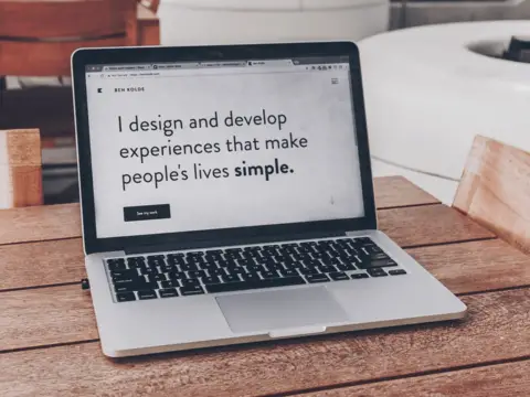
Nevertheless, a logo is a great starting point and is likely the first thing people will see. In fact, consumers form a first impression of a brand's logo within 10 seconds.
As you begin to create a new logo design, there are a few things to consider:
- Trends: Maybe your competitors have adopted more modern-looking logos and you're sticking with an "old" logo to be different. Whatever the case, pay attention to your target audience and what resonates most with them.
- Major changes: Your business could be undergoing some big changes. Maybe you're a cleaning business that's looking to expand into the commercial sector. A logo showing a house or domestic setting probably won't work well for your branding anymore.
- Design: Perhaps your logo's design is too complex and not simple enough. It could even be hurting your conversions. Redesigning your logo can help make your brand more universal and resonate with a wider audience.
COLOR: A BRANDING MUST
Your brand's colors will appear on your logo, website, and marketing material. Choosing the right color palette for your rebrand is vital for a variety of reasons. First, color helps people recognize your brand and commit it to memory. Second, color can attract the right kind of customers. Third, a brand's colors can have an impact on how it's perceived by consumers. Here are some stats about branding and color:
- A signature color can increase brand recognition by 80%.
- 33% of the top 100 brands use the color blue in their logo. The color blue relates to one-one-one communication and personalized messaging. This helps customers feel more connected to the logo and ultimately, the brand.
- Up to 90% of snap judgments made about a product can be based on color alone.
- Colors influence how consumers view the "personality" of a brand.
To create a color palette that attracts your ideal audience, you should know about these common color associations:
- Yellow: Positivity, happiness, warmth
- Blue: Trustworthy, loyal, dependable, serene
- Green: Nature, growth, freshness, serenity, healing
- Purple: Loyalty, nobility, luxury
- Red: Energy, power, danger, war, passion, love
- Orange: Energetic, warm, joy, sunshine, playfulness
- Pink: Femininity, innocence, romance, softness
- Brown: Simplicity, warmth, neutrality, earthiness
- Black: Power, elegance, authority, intelligence
These colors and their meanings should help guide you through creating a distinct color palette for your rebrand. Mix and match colors together until you find the right combination. Consider pairing colors together that sit next to each other on the color wheel. You can also use complimentary colors that sit opposite each other on the color wheel (i.e. purple and yellow). Also, add contrast by pairing light and dark tones. Choose your dominant and accent colors. Taking these steps, you can create a unique, versatile color palette.
STOCK PHOTOGRAPHY? OVERUSED
Stock photos are pretty much visual cliches. In the corporate world? How about an image showing men in business suits high-fiving all at once? Do you own a restaurant? Maybe use a photo of a chef beaming at the camera. Bad ideas. Stock photos lack originality and it's very likely that your audience will see the same stock image on another site. This communicates brand inconsistency and makes your brand appear unoriginal.
When developing your visual identity, it's always best to have your own visuals. Whether you're taking your own photos that communicate your brand message or developing graphics that tie in to your brand identity, you're truly reflecting your company and its vision. Your brand's visual identity should show consistency and create a unified and cohesive experience for your customers.
FONTS AND PERSONALITY
Typography may just be the styling of words, but it can communicate a message beyond words. For example, Banz used bold, solid typography with rounded corners that communicates a rational and emotional balance. The arch in the letter "A" curves and expands, which symbolizes the products' versatility to accommodate a growing child.
When you're trying to rebrand, your font needs to adapt to customers' expectations. It also needs to be legible and functional in all environments while communicating your brand's visual identity and personality all at the same time.
All in all, be fluid with your rebranding approach. Leave space for new ideas and unexpected changes. Your brand should be as awesome as your product or service. Using a marketing agency like MarComm can easily and affordably help with a rebrand to create a cohesive experience for customers and a polished and professional look for the business that will get you noticed.